Network Monitoring
Your whole network on one colour-coded map — every customer radio and network device pinged every minute of every day, with history going back forever. Know about problems before your customers call, and know exactly which fix worked.
The network map
Every site, backhaul, and access point, colour-coded by live quality. Green means healthy, yellow means degrading, and the map updates in real time as conditions change — one glance tells you how the whole network is doing.
Sites roll up into regions as you zoom out, so a 400-site network is as readable as a 40-site one.
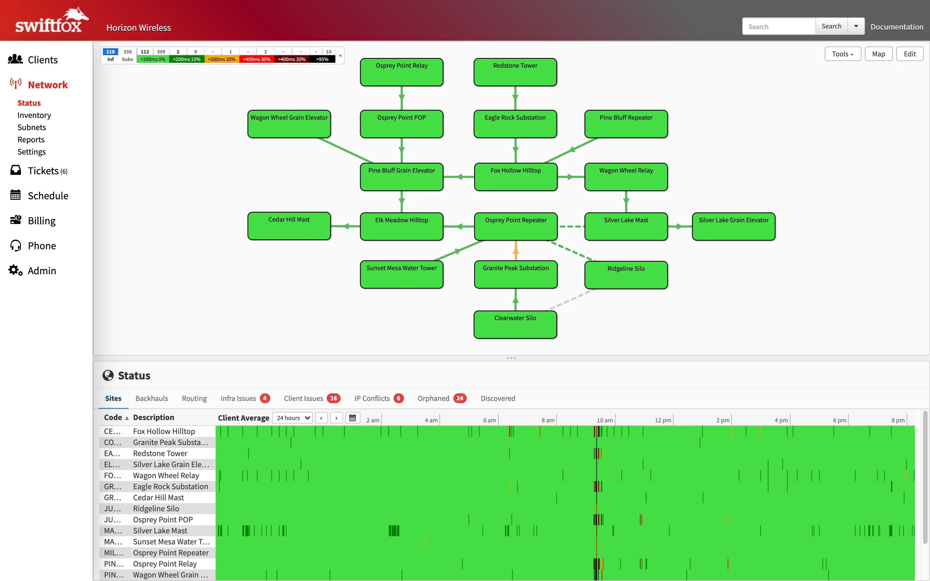
The live network status page — a mid-morning interference event is visible in several site pinglogs.
The Pinglog
See every customer on an access point and their performance over the past day, week, month or even year. Know instantly whether a channel change has fixed the issue, or when you need to upgrade equipment for capacity.
Discover network issues before your customers do!
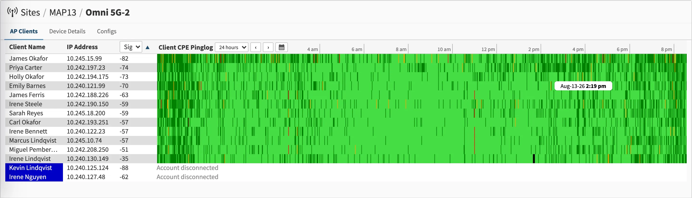
Every customer on one access point, one row per radio — the strips make a channel problem obvious at a glance.
Backhaul capacity, measured
Reported capacity is obtained from every major model of wireless equipment and graphed against usage. For even greater accuracy, single-stream TCP speedtests can be automatically performed on all backhauls between compatible MikroTik routers.
This live capacity data is what drives the automatic MPLS balancing — read the deep dive →
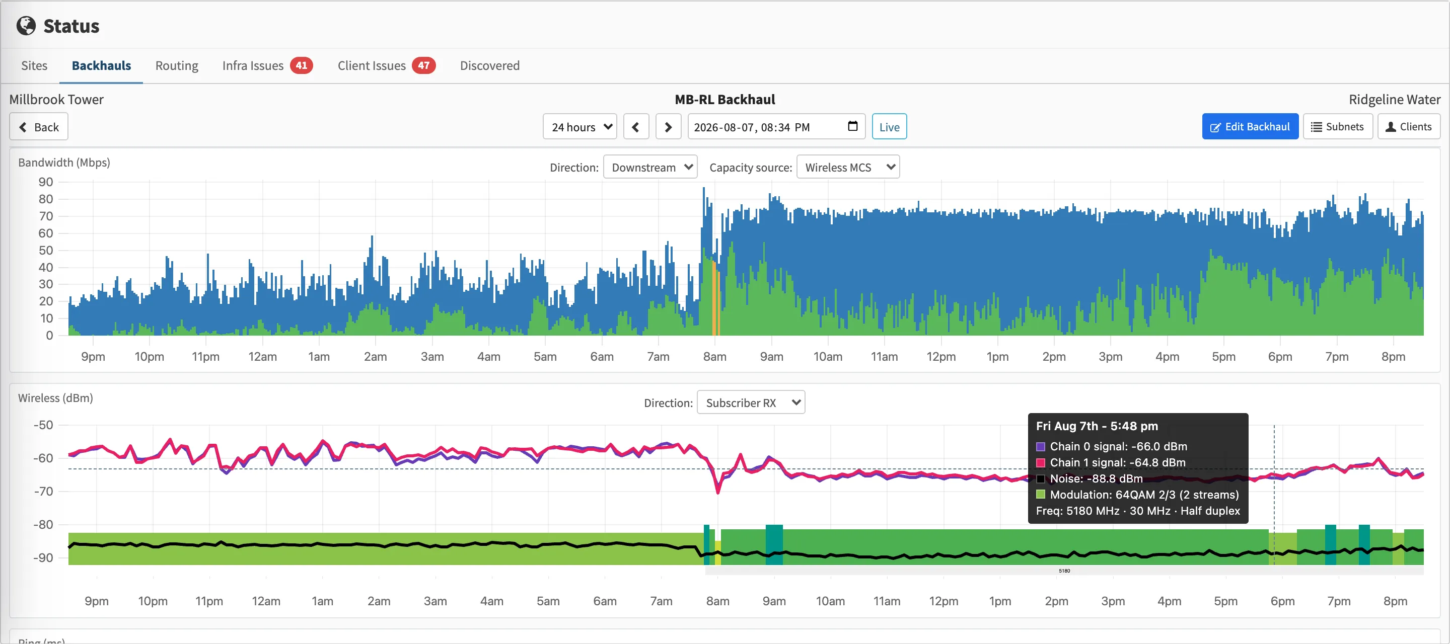
A backhaul through an overnight modulation drop — measured capacity falls, and the wireless chart underneath shows exactly why.
Frequency planner
Current frequencies are monitored from all major models of wireless equipment and displayed on a chart to help avoid conflicts. Both full and half duplex radios are supported.
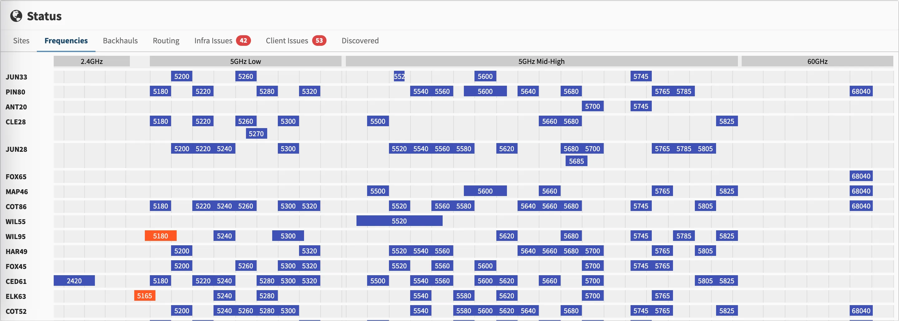
The whole network's spectrum on one chart — the two orange entries are conflicts worth fixing.
Customer LOS path plots
Enter the customer's address and immediately discover which towers would best provide service based on topography and line of sight.
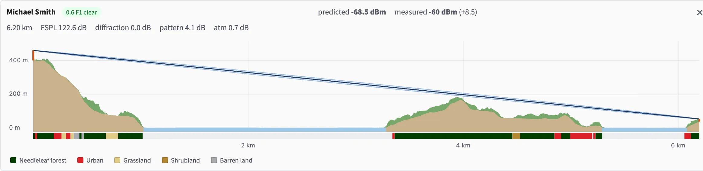
A 6 km path with terrain, land cover, and predicted vs measured signal.
Paging that wakes the right person
Ping every customer radio every minute of the day, storing the history going back forever. Robust paging schedule features set varying time-of-day based thresholds and on-call rotations.
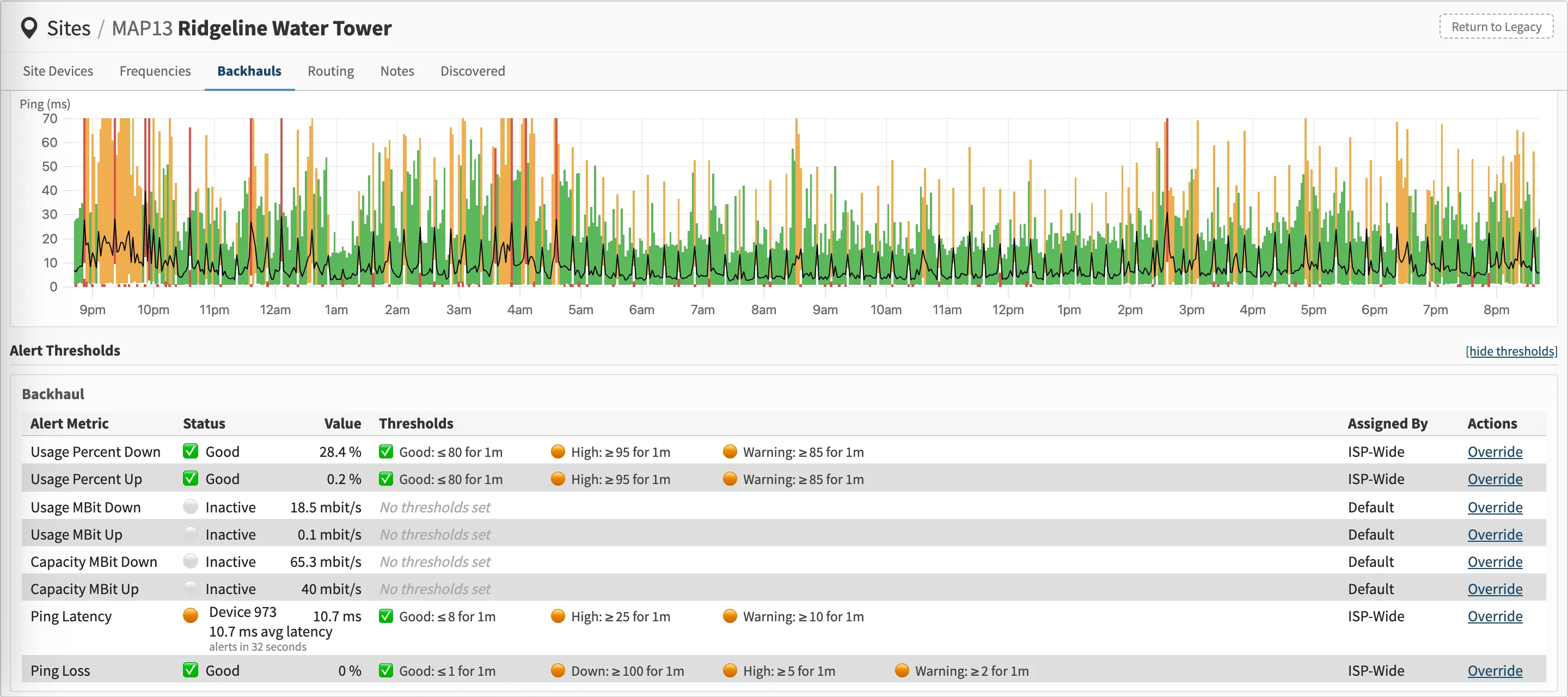
Per-metric thresholds with ISP-wide defaults and per-site overrides — one latency metric is 32 seconds from paging someone.
Everything on this page is included in the Network Management tier — $0.75 USD per subscriber per month.